
What The Food
Map Platform

Role: Lead Product Designer
Timeline: 6-8 weeks
Project Type: Interactive Map
Link: EU Commission: What The Food
Project Overview:
We partnered with The European Commission’s Farm to Fork (F2F) to build "What The Food ", an interactive custom platform for readers to discover 10 inspiring stories about innovative farms and initiatives contributing to a more sustainable food system for Europe. The partnership objective is to drive awareness and engagement of the F2F strategy to VICE audiences (20-35yo) across the 27 EU member states, and more specifically to young parents.
It is also the title of a documentary film in which the host, Dutch chef, culinary journalist and young mother Claire Van De Graaff travels to three different farms in Croatia, Italy and Belgium, with very distinct approaches to make their farming practice as sustainable as possible.
All content is available in 8 different languages, to raise awareness about the EU’s Farm to Fork Strategy.

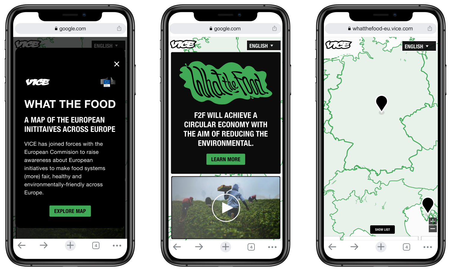
The experience includes
Welcome Modal — An introductory pop-up that provides context for the What The Food campaign and guides users into the experience.
Hero Section — A landing section featuring a Learn More call to action, an informational modal explaining the Farm to Fork initiative, and a featured documentary video.
Interactive Map — The core experience of the platform, allowing users to explore ten European countries. Selecting a country reveals contextual content cards that link to in-depth editorial articles.
Contact CTA — A clear call to action at the end of the experience, providing users with a direct way to learn more or get in touch.
To support a broad European audience, the platform was fully localized in English, Dutch, French, German, Greek, Romanian, Italian, and Spanish. Keeping in mind of character count for each language across the board.
Design Explorations
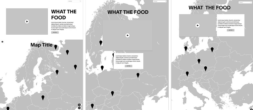
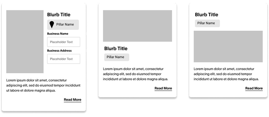
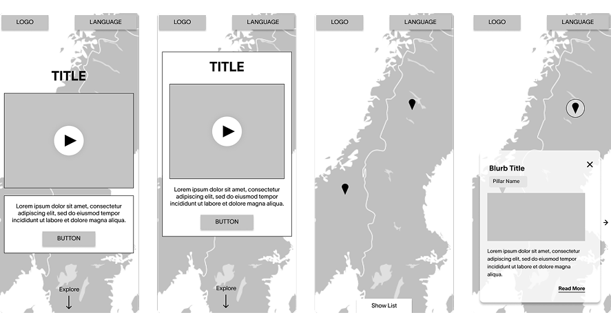
Given that the interactive map was the centerpiece of the experience, I explored multiple visual directions to find the right balance between editorial storytelling, usability, and geographic clarity. I began with low-fidelity wireframes for the core components:
Map concepts of the map layout and placement of featured content
Article Cards Designed as visually engaging entry points into content. These cards would highlight key visual elements from the article, enticing users to click and explore.
Map Styling
I experimented with several map treatments, evaluating color palettes and interaction states to ensure each country was easily identifiable while complementing the campaign's editorial aesthetic. The final design prioritizes clarity without overwhelming the surrounding content.

Content Card Carousel
I also explored different layouts for the destination content cards displayed after selecting a country. Iterations focused on improving readability, surfacing article previews, and creating a seamless transition between map exploration and editorial content. The final carousel balances visual storytelling with clear navigation, making it easy for users to discover and browse related articles.

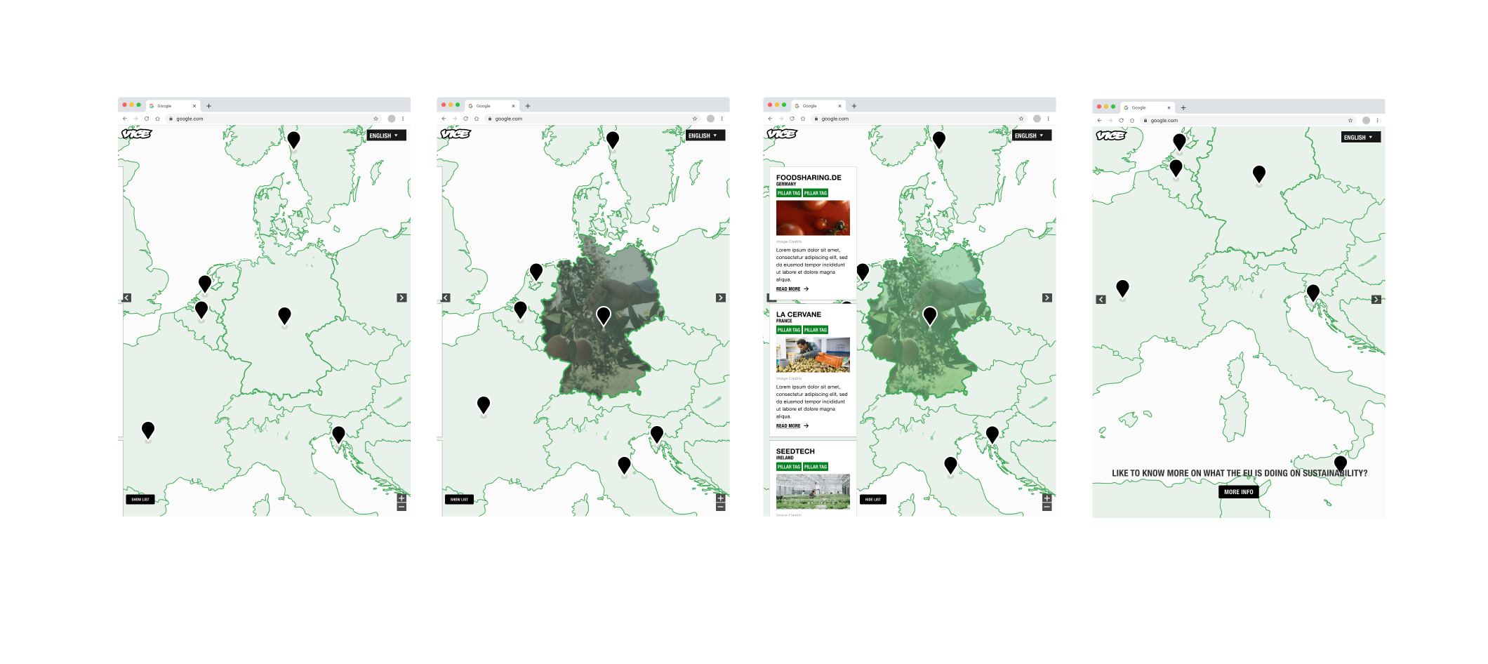
Final Designs Map States with Active Carousel
Through the explorations we were able to find the balance of that bold and engaging design while still aligning with the VICE brand. As a result of that is the lighter map background and usage of the light green and green accents.For desktop’s hover/active country states we did a variation of color fills from dark, light and green gradients and decided with a green gradient on top of the image which still kept that clean feeling we were looking for.

For the card style we wanted to ensure what would be the best usage of showcasing the content layout.On scroll on mobile we knew that the card stack would slide up. Having the show list tab at the bottom of the screen, users can either tap it or select a country to display the card stack. On the larger breakpoints the card stack would be a vertical swipe on the left side of the screen. Where users can continue to explore the map.
Outcome
As we transitioned into development, I worked closely with the developers to implement the design. My involvement extended to making sure that the interaction design was fully realized in the final build, particularly for the card stacks and map explorations.
Collaboration is key Close collaboration with stakeholders, including the European Commission, was essential for gathering accurate data and ensuring alignment with the campaign objectives overall.
Iterative design process Iterative design helped identify and address issues early in the development process, leading to a more of an intuitive and effective interactive map.
This project has not only been about creating a digital resource but also leveraging digital platforms to amplify voices and mobilize communities.And with this platform we were able to solve the problem by creating an accessible user-friendly map available across multiple devices and 8 languages, successfully incorporate interactive and intuitive features, applied design elements to retain out intended target audience and users' attention while conveying information effectively and was able to represent diverse perspectives.