
23in23
Hub Page

Role: Lead Product Designer
Timeline: 2-4 weeks
Project Type: Site Redesign
Project Overview:
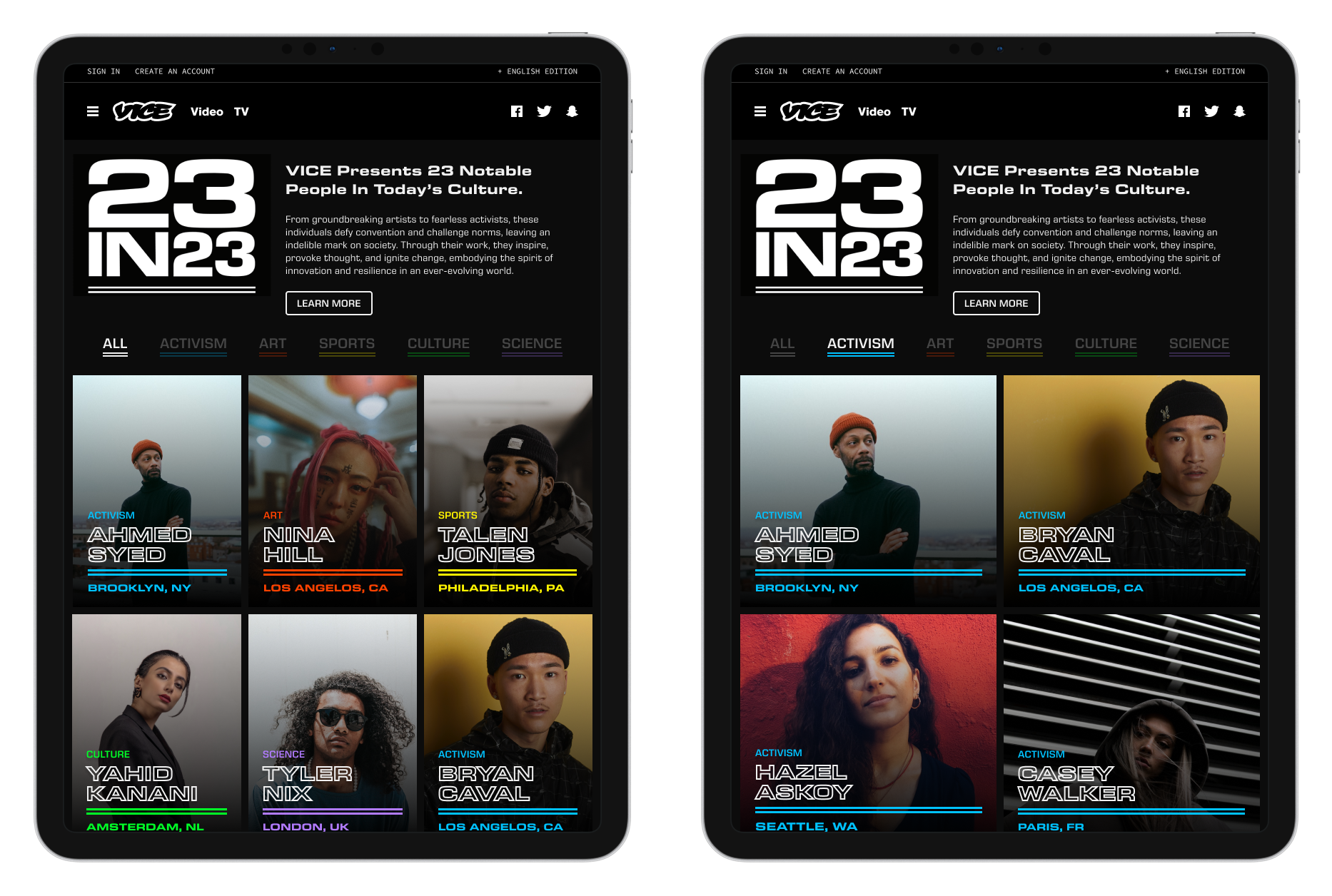
The "23 in 23" project was centered around a special initiative to highlight 23 influential cultural figures in the year 2023. The project aimed to showcase individuals shaping the cultural landscape in various fields, including music, fashion, art, and social impact. The goal was to create an engaging digital experience that not only presented these profiles but also made them accessible through dynamic visuals and intuitive interaction.
As one of the key designers on the project, my role focused on creating a user-friendly platform that could effectively display diverse media types, including articles, videos, and image galleries, while ensuring a consistent and engaging user experience across devices.
Prototype:
Explore the Figma prototype at your leisure.
Optional: For the full mobile experience download the Figma Mobile app


Design Challenge & Approach
The project required a visually engaging experience that could seamlessly integrate multiple content formats while creating an immersive way for users to explore each story. The primary challenge was designing a system that worked across both desktop and mobile experiences without sacrificing visual impact, usability, or the depth of the storytelling.
With 23 featured figures and a wide range of content — including video interviews, editorial stories, and image galleries — we identified the need for a structure that made the experience approachable and easy to navigate. To prevent users from feeling overwhelmed, we organized the platform into modular content sections that allowed each story element to have its own space while maintaining a cohesive narrative flow.
A clean, minimalist design system was established to balance the richness of the content with intuitive navigation. This approach allowed the media to remain the focal point while creating a flexible framework that supported exploration, discovery, and engagement across devices.

Creating a cohesive experience across desktop and mobile was a key design consideration. We developed a responsive framework that adapted the layout, interactions, and content hierarchy across screen sizes while preserving the immersive storytelling experience.
Particular attention was given to mobile usability, including touch-friendly interactions, responsive typography, image optimization, and performance considerations. These decisions ensured that users could seamlessly explore the content regardless of device, while maintaining the visual impact and editorial quality of the experience.

Interactive Profiles
I led the design of the artist profile experience, creating a system that allowed each profile to feel distinct while maintaining a cohesive visual language across the platform. Through thoughtful use of imagery, typography, and content hierarchy, each profile was designed to highlight the artist’s story and encourage deeper exploration.
Collaborative Prototyping
I collaborated closely with designers and developers throughout the design and prototyping process, using tools such as Figma and Webflow to test interactions, refine layouts, and validate the overall experience. This iterative approach ensured the final product accurately reflected the original design vision while balancing technical considerations and usability.
Key Learnings & Design Exploration
This project reinforced the importance of creating modular, responsive design systems that can support rich storytelling while maintaining a clear and intuitive user experience. Balancing immersive content with accessibility and ease of navigation was essential to creating a platform that encouraged exploration.
As part of the design process, I explored a wide range of visual directions for the profile modals, testing various color palettes, including dark and light accent treatments. These explorations helped establish a flexible visual system that added personality to individual profiles while maintaining consistency across both desktop and mobile experiences.

The goal was to create a flexible design system that allowed editors to customize each profile while maintaining a cohesive overall experience. By introducing both dark and light theme variations, editors could select a visual treatment that best complemented each featured profile and its content.
This approach added depth and personality to the platform while preserving consistency across the interface. The color explorations helped establish a scalable system that enhanced readability, improved content hierarchy, and gave editors creative control over the presentation of each profile without compromising the overall visual language.


Final Outcome
The 23 in 23 project reinforced the importance of cross-functional collaboration in creating meaningful digital experiences. Working closely with design, development, and content strategy teams allowed us to align creative vision with technical execution and editorial goals, resulting in a cohesive and impactful platform.
Through an iterative design process, we created a visually engaging experience that combined rich media, interactive storytelling, and a flexible content system. The final product gave users an immersive way to explore the stories of influential cultural figures from around the world while maintaining an intuitive and accessible experience across devices.